Rebranding never goes in one direction, it’s a way to transform a brand multi-directionally. From reshaping to providing a fresh perspective, rebranding is the best way to connect with your target audience.
But the question is, does this work?
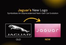
Recently, the new Jaguar logo amazed everyone. Its new logo launch on November 19, 2024, sparked dazzling questions from its perspective.
 Jaguar plans to launch three new cars in the market in 2026, and to this end, it just rebranded its logo to spread that vibe.

Whether it’s about modernizing their image or adapting to the new generation, rebranding, and new logo design trends opens up the door of opportunity to create a more robust and more creative identity.
Evolution of the Jaguar Logo
From building motorcycle sidecars to producing modern luxury cars, Jaguar has undergone significant evolution.

Let’s explore how their logo designs have transformed over time.
1922-1935
In 1922, the company started as Swallow Sidecar Company. Its logo simply reflected the company’s name alongside wing elements. The color composition remains blue and red color.
1935-1945
In 1935, a new logo was introduced that featured the text ‘SS Jaguar.’ The ‘SS’ represents ‘Swallow Sidecar Company,’ and was enclosed in a sharp hexagonal structure with stylish wings. The logo’s color scheme was comprised of brown shades with black accents.
1945-1951
On March 23, 1945, S.S. Cars shareholders organized a meeting and decided to change the company name to ‘Jaguar Cars Limited’ and also redesign the new company logo. The new logo closely resembled the previous design but replaced “SS” with “Jaguar” to reflect the new company name. It appeared colorless and displayed the name in a hexagon alongside eagle wings.
1951-1957
During this period, the logo was redesigned to the most simplistic look without any design element. It featured only the company name, written in elongated, serif-font black uppercase characters. This minimalist look remained for about six years.
1957-1982
In 1957, Jaguar introduced a new badge-like logo, which looks like a circular metallic medallion. At the center was a golden wildcat head while the company name was displayed in gold uppercase serif fonts around the medallion’s edge.
1982-2001
This logo featured a complete wildcat with the company name mentioned below. The logo looks so natural with wild elegance. The company name, ‘Jaguar’ is mentioned in bold uppercase in a dark green color and the animal design gives it a dynamic look, highlighting natural elegance.
2001-2012
In this logo, Jaguar simplified the colors and made it for a black and white color scheme. This time, the cat looks clearly drawn, and the company name appeared in sleek, sans-serif fonts with smoother lines.
2012-2021
The logo adopted a 3D design with a silver-grey finish. It gives a logo a sleek and luxurious touch. This logo design was widely appreciated for its high quality and stylish appearance.
2021-2024
The company revisited a previous design with a flat aesthetic. It featured a badge-like appearance with a leaping cat illustration. The logo text was presented in uppercase sans-serif fonts.
Now
Recently, Jaguar unveiled its new logo, which combines simplicity with elegance. The design features mixed-case lettering in dark grey as it delivers a modern and sophisticated look.

What’s new in the Jaguar logo?
Jaguar has completely revamped its logo. According to their spokesperson, the new logo looks like a blend of upper and lower character cases. This gives a logo a seamlessly sleek and simplistic look.
Jaguar also released a new video highlighting the new logo design and rebranding perspective, but unfortunately, it didn’t receive good traction. Jaguar’s new logo is accompanied by some catchy slogans such as “Live vivid,” “Delete ordinary,” and “Copy nothing.”
View this post on Instagram
Wrapping Up
With changing times, the automobile industry is increasingly shifting toward electric vehicles. To stay competitive in the market, the new Jaguar logo highlights the company’s readiness to switch towards next-generation electric car models. The brand has set an ambitious target of becoming an exclusively electric vehicle manufacturer brand by the end of 2026. As part of this initiative, Jaguar has redesigned its logo to reflect its commitment to this vision. While the new logo has faced some criticism, it aligns with the company’s strategy for its futuristic cars.
FAQs
Ques 1. What is the symbol on Jaguar cars?
Ans. The symbol displayed on the Jaguar car is a leaping cat from the side. This symbol represents its brand identity.
Ques 2. Why is Jaguar changing its logo?
Ans. Jaguar launched its new logo to redefine its brand. It’s a part of their plan to launch three electric cars by 2026 and to highlight that the company is now moving towards manufacturing electric car models.
Ques 3. Who is the founder of Jaguar?
Ans. In 1922, Sir William Lyons founded a motorcycle sidecar company called the Swallow Sidecar Company, which was later renamed “Jaguar.”
Ques 4. What does the Jaguar logo represent?
Ans. Jaguar’s new logo represents a sleek and minimalist look. When you analyze it closely, you will find there are lines surrounding it which makes it an electrifying look. This new logo is a step of their rebranding strategy to become an electric car manufacturer by 2026.
We hope this article will be helpful to you. Stay tuned for upcoming articles.
READ MORE: 10 Passive Income Ideas in India to Become Financially Strong
If you like our article, please subscribe to BsyBee Design for the latest updates on design. If we forget anything, share your creative ideas in the comments section.
Follow us on Facebook, Linkedin, Instagram, Pinterest and YouTube.


