


Color is a powerful tool in graphic design, influencing emotions, perceptions, and behavior. The study of how color affects human psychology is known as color psychology. In the realm of graphic design, understanding color psychology is a fundamental skill that can significantly impact the effectiveness of a design. It goes beyond aesthetics.
Let’s get into the details of this topic:
Why is Color Psychology Important in Graphic Design?
Color psychology plays a vital role in graphics design, greatly influencing visual communication and creating impactful design experiences. Colors have the ability to evoke specific emotions and convey messages without the need for words. Harnessing this power allows designers to create visually compelling and emotionally resonant designs that captivate and engage the audience.
- Emotional Impact: Colors can evoke a wide range of emotions. For instance, warm colors like reds and yellows can create a sense of energy and urgency, while cool colors like blues and greens can evoke calmness and tranquility. Understanding the emotional impact of colors allows designers to strategically use them to elicit specific feelings in the audience.
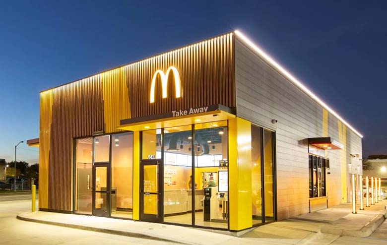
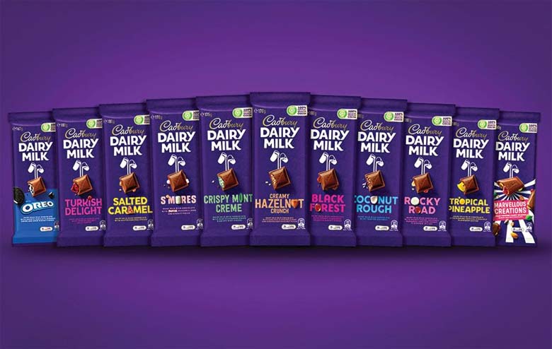
- Brand Identity: Consistent use of colors in branding establishes a visual identity for a brand. This recognition becomes integral for brand recall and consumer loyalty. Color choices in logos, packaging, and marketing materials contribute to the overall perception of a brand, influencing how it is perceived by the target audience.
- Communication and Messaging: Colors act as a non-verbal form of communication. Different colors can convey different messages and meanings. For example, a healthcare brand may use calming blues to convey trust and reliability, while a tech company might opt for vibrant and energetic colors to express innovation and dynamism. Designers use color strategically to align with the intended message of the design.
- User Experience: In digital design, color plays a crucial role in user experience. The right color choices can guide users through a website or application, highlight important elements, and create a seamless and enjoyable interaction. Poor color choices can result in confusion or frustration, negatively impacting the overall user experience.
What is the Concept of Color Psychology?
This concept explores the psychological and physiological responses that individuals have to different colors. While color preferences can be subjective and culturally influenced, there are certain universal associations that designers often take into consideration.
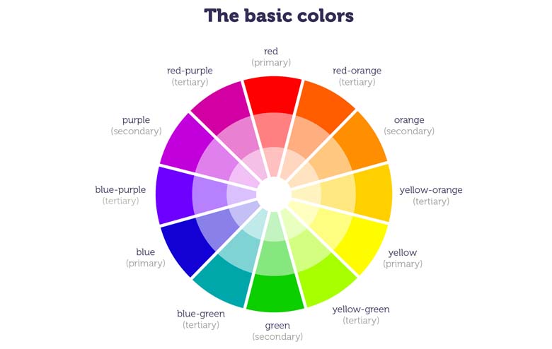
Warm Colors
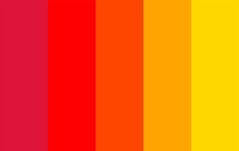
Warm colors, including reds, oranges, and yellows, are often associated with energy, passion, and warmth. They can evoke a sense of urgency and excitement. Brands often use warm colors to grab attention and create a lively atmosphere. However, excessive use of warm colors can be overwhelming, so balance is crucial.
Cool Colors
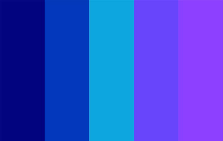
Cool colors, such as blues and greens, are linked to calmness, tranquility, and reliability. These colors are often used in industries that want to convey trust and professionalism, such as finance and healthcare. Cool colors can also create a sense of spaciousness and serenity in design.
Neutral Colors
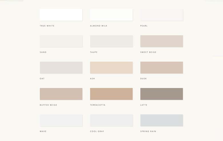
Neutral colors like grays, browns, and whites are often associated with simplicity, elegance, and sophistication. They serve as a versatile backdrop, allowing other colors to stand out. Neutral colors are commonly used in minimalist design and can convey a sense of timelessness.
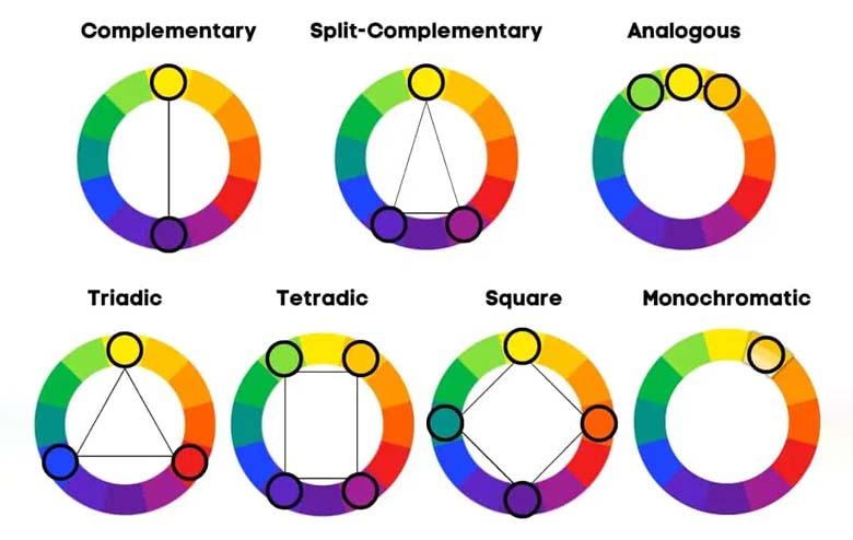
Contrast and Complementary Colors
Understanding the principles of contrast and complementary colors is essential in creating visually appealing designs. Contrast, achieved by placing colors with different values or hues next to each other, adds visual interest. Complementary colors, positioned opposite each other on the color wheel, create a dynamic and harmonious effect when used together.
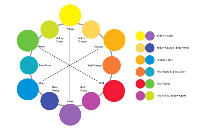
Color Harmony
Achieving color harmony involves selecting a cohesive color palette that works well together. Designers often use color theory, including concepts like analogous and monochromatic color schemes, to create visually harmonious designs. Harmonious color choices contribute to a balanced and aesthetically pleasing composition.
Colors possess a silent language that communicates with our subconscious. Understanding this emotional resonance is crucial in harnessing the power of color in graphic design.
Here’s a glimpse into how different colors can spark distinct emotions and sentiments:
Red
Emotion: Passion, Energy, Excitement.
Sentiment: Red is a bold and attention-grabbing color. It elicits feelings of passion, love, and urgency. It’s often associated with powerful emotions, making it an ideal choice for brands aiming to create a strong and dynamic impression.
Blue
Emotion: Calmness, Trust, Stability.
Sentiment: Blue is a serene and tranquil color. It instills a sense of calm and reliability, making it popular in industries where trust is paramount, such as finance and healthcare. Lighter blues can convey openness, while darker blues evoke a sense of professionalism.
Yellow
Emotion: Happiness, Optimism, Warmth.
Sentiment: Yellow radiates positivity and energy. It is associated with sunshine and happiness, making it an excellent choice for brands that want to convey a friendly and optimistic vibe. However, too much yellow can be overwhelming, so balance is key.
Green
Emotion: Growth, Freshness, Harmony.
Sentiment: Green is often linked to nature and the environment. It symbolizes growth, balance, and harmony. Brands associated with health, wellness, or sustainability often use shades of green to convey a sense of vitality and eco-friendliness.

Purple
Emotion: Royalty, Luxury, Mystery.
Sentiment: Purple has long been associated with royalty and luxury. It exudes sophistication and elegance, making it a popular choice in high-end branding. Additionally, purple carries a sense of mystery and creativity, adding a touch of intrigue to a design.
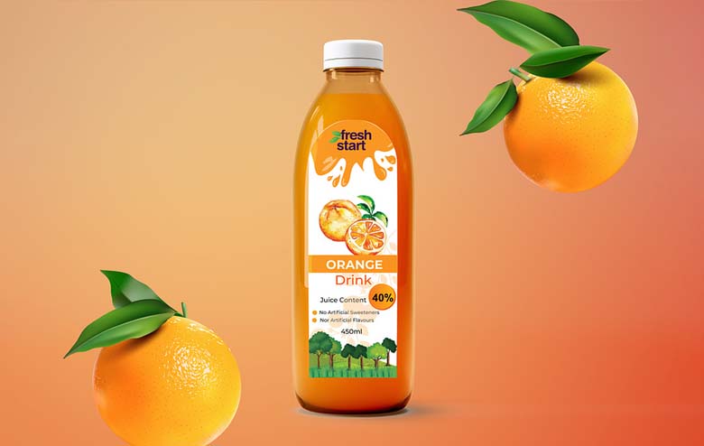
Orange
Emotion: Energy, Playfulness, Warmth.
Sentiment: Orange is a vibrant and energetic color. It combines the passion of red with the optimism of yellow, creating a warm and inviting feel. Brands looking to convey a sense of enthusiasm and playfulness often incorporate orange into their designs.
Black
Emotion: Elegance, Power, Sophistication.
Sentiment: Black is the epitome of sophistication. It conveys a sense of luxury, formality, and power. Many high-end brands use black as a primary color to evoke a timeless and elegant aesthetic.
Brown
Emotion: Earthiness, Stability, Warmth.
Sentiment: Brown is a grounded and earthy color. It conveys stability, reliability, and a sense of warmth. Brands associated with nature, outdoor activities, or organic products often use brown to establish a connection with the natural world.
Applying Color Psychology in Graphic Design:
- Understanding the Target Audience: The first step in applying color psychology in graphic design is understanding the target audience. Different demographic groups may respond differently to colors based on factors such as age, gender, and cultural background. Designers need to tailor color choices to resonate with the preferences and emotions of the specific audience they are targeting.
- Establishing Brand Identity: For businesses and organizations, establishing a strong brand identity is paramount. Consistency in color usage across various brand elements, such as logos, websites, and marketing materials, helps create a cohesive and recognizable brand image. The chosen colors should align with the brand’s personality and the emotions it aims to evoke.
- Creating Visual Hierarchy: Color can be used to create a visual hierarchy, guiding the viewer’s attention to the most important elements in a design. Bold and contrasting colors can draw attention to key messages or calls to action, while softer colors can be used for secondary information. This strategic use of color enhances the overall effectiveness of the design.
- Considering Cultural Sensitivities: Global designs need to be mindful of cultural sensitivities associated with color. For instance, while white may symbolize purity in Western cultures, it can be associated with mourning in some Eastern cultures. Being aware of these cultural nuances ensures that designs are respectful and resonate positively with diverse audiences.
- Adapting to Trends: Design trends, including color trends, evolve over-time. Staying informed about current design trends can help designers create contemporary and relevant visuals. However, it’s essential to balance trendy elements with timeless principles to ensure that designs remain relevant for an extended period.
Final Thoughts
In conclusion, color psychology is a powerful tool that every graphic designer should master. It goes beyond choosing visually appealing colors; it involves understanding the emotional impact of colors on the audience and strategically using them to convey messages. By leveraging color psychology, designers can create designs that not only look good but also resonate with the intended audience on a deeper level. The thoughtful application of color psychology elevates graphic design to a realm where art and psychology intersect, creating visually compelling and emotionally resonant experiences.
As a beginner in graphic design, embracing the principles of color psychology opens up a world of creative possibilities and sets the foundation for impactful and meaningful design work.
Bring some colors to your design! Keep Designing!
We hope this article will be helpful to you. Stay tuned for upcoming articles.
READ MORE: Peach Fuzz: Pantone Color of the Year 2024!
If you like our article, please subscribe to BsyBeeDesign for the latest updates on design. If we forget anything, share your creative ideas with us in the comments section.
Follow us on Facebook, Linkedin, Instagram, Pinterest and YouTube.


Excitement or Urgency, whereas shades of blue might encourage feelings of relaxation. By applying color psychology in graphic design, you can enhance the mood and tone of your artwork, ensuring that it resonates with your intended.