


Importance of Balance in Design- it’s the design that makes you want to look twice. It’s about restraint and density. It’s about simplicity and relationships.
When it comes to arranging the visual elements in a layout, balance is an important feature. One of the crucial aspects of art and graphic design, it helps an image gain stability in the way it looks. Balance makes a picture seem pleasing to the eye.
Balance is responsible for adding weight to the images on a screen. It makes them look heavier or lighter, depending on the demand of the image. Before moving to further details, let us understand what balance is.
The Meaning of Balance
Balance is the key to a striking design. But what exactly is it?
Balance refers to the proper distribution of the necessary elements in a design or art. It helps in giving the picture stability, which appeals to the human eye. Providing a balance meets human nature, which searches for symmetry in everything that they see. By adding weight to the images, we give it a sense of balance and security.
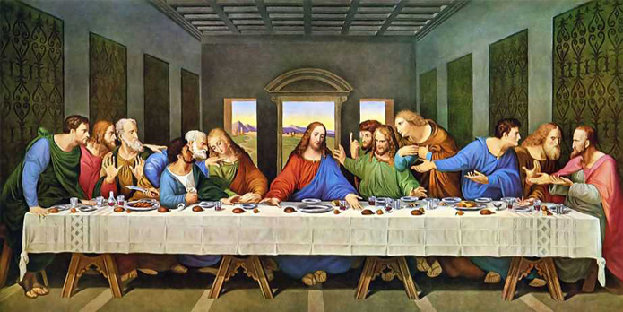
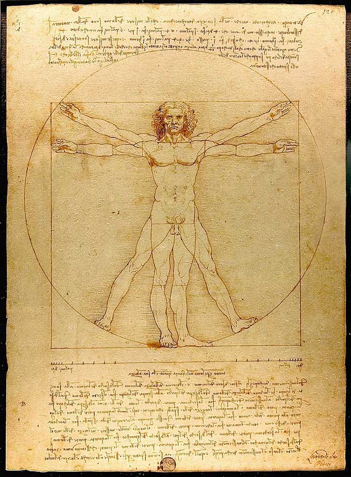
Balance might appear in some prehistoric art and cave paintings, but they got their importance during the renaissance period. Artists consider Leonardo Da Vinci as the pioneer of adding balance to art and images. His famous paintings of “The Last Supper” and “Vitruvian Man” are the best examples of balance in the artwork.
Balance comes in all Shapes and Sizes
When we talk about adding balance to a visual, it is not just one type. Balance comes in all shapes and forms for different designs. Different picture demands a different kind of balance.
Different types of balance add to making a picture gain its stability and look complete. Let us discover the types of balances in detail and Check this latest post of BsyBeeDesign.
View this post on Instagram
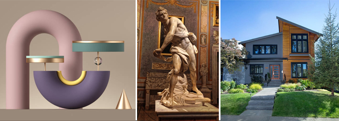
Balance that makes images look like a Mirror Reflection
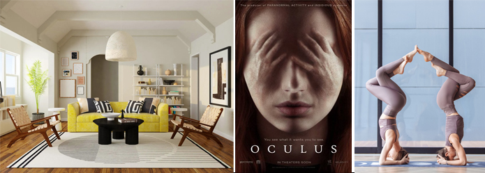
One can achieve Symmetrical Balance by adding equal weight to all the elements surrounding the picture composition’s focal point. The point of focus can be anywhere; horizontal, vertical, or diagonal. The image looks like a mirror reflection-perfect in its appearance.
Symmetrical Balances look attractive and make any messy or imperfect visual into a perfect one.
Balance that has Irregular Elements
An Asymmetrical Balance is the result of irregular elements held together when an image has elements that are not the same, yet due to an equal weight strike, a balance results in an Asymmetrical Balance.
There can be two elements that are different in shape but have the same weight. Asymmetrical Balances make more attractive visuals than Symmetrical Balances, as they create dynamic shapes and sizes. In this area, the designer has to be confident about using various shapes, colors, and types of elements and bring them together to create a balance in the end.
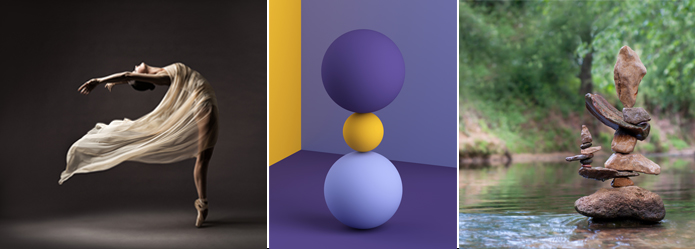
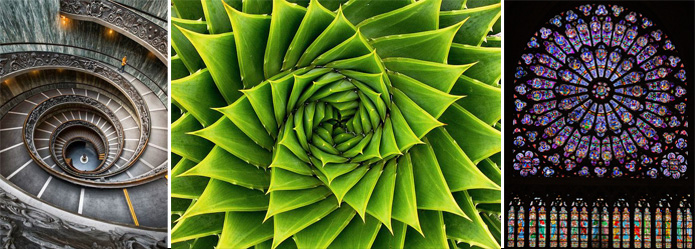
Balance that creates a Calming Effect
Images and visuals with a calming effect use a Radial Balance to make their center point the focus of attention. The motive is to let the elements spread out from the focal point and create a calming effect.
Radial Balance draws inspiration from the environment around us. Whirlpools, tree rings, flower petals, etc., are perfect examples of this kind of balance in visuals.
When it comes to Graphic Design, spirals can act as major catalysts in drawing the viewer’s attention toward the center point of the image. You will find various posters and sale pamphlets using this spiral design to attract the customer’s attention to the firm’s contact. Their primary motive is to make the customers visit them by seeing their offers.
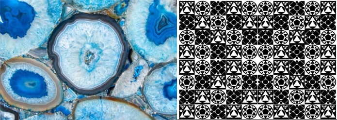
Balance that unites the Elements as One
A designer can achieve this balance by giving equal weight to many elements. Also known as Crystallographic Balance, this does not reflect symmetry but focuses on integrating all elements into one whole. This balance tricks the user into believing the image as one whole, as it is difficult for him to identify the different elements.
Crystallographic Balance can make a chaotic picture into a soothing and composed one. The above four balances have their respective contribution to making a picture complete. After reading the above, we hope you understand why it is important to balance any image and make any flawed picture look perfect.
“Design Tip – Find Your Right Balance Rhythm and Create Magical Experiences”
We hope this article will be helpful to you. Stay tuned for upcoming articles.
READ MORE: An Overview to Visual Elements & Design Principles
If you like our article, please subscribe to BsyBeeDesign for the latest updates on design. If we forget anything, share your creative ideas with us in the comments section.
Follow us on Facebook, Linkedin, Instagram, Pinterest and YouTube.


The Radial Balance reminds me of “Fibonacci” numbers (although Indian Acharya Pingala had given this theorem or number gyan as early as 200BC) and “Phyllotaxis” and of “golden ratio”