


What if I told you that you can easily convert your software or website’s visitors into customers?
It involves carefully crafting a product’s user interface diagram to make user interaction as simple and effective as possible.
But how can you do this?
The process of designing a user interface (UI) requires a deep understanding of the needs of users, a solid grasp of usability, and a touch of imagination and creativity.
This blog post takes you on the journey of UI designs, examples, and templates, which you can use for inspiration to create a beautiful user interface for your website or product.
Let’s begin with the beginning.
Why Does the User Interface Matter?
With the increasing trends of attractive user interface (UI), everyone is leveraging the power of great visuals. Here are a few reasons you should focus on improving the design of the user interface (UI).
- Increase Customer Base: When you improve your website’s user interface (UI) and make it light and attention-grabbing, it will further help your website rank in search engines. This will lead to more traffic and customers.
- Improve Brand Reputation: An exemplary user interface (UI) can improve brand loyalty.
-
Let Me Explain: When your website’s user interface (UI) is eye-catching with authentic information, it will retain users on your website.
- Increase Conversions: An exemplary user interface can convert 35% of visitors into customers. What exactly do users want? Think, people need more time to scroll through boring pages, so when you present any information quickly and attractively, it will help them to take action such as purchase or sign up, etc. A user interface that looks appealing and crystal clear can increase the conversion rate.
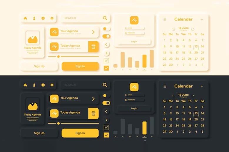
How User Interface Diagrams Use in Software Engineering
When designing any software or website, it’s the first thing to create a user layout that not only looks appealing but also lines up with the software or website.
For example, Suppose you are designing a layout for any fitness app. It would be best if you created a user interface that matches the fitness theme.
- Visual Representation: User interface diagrams are a great way to showcase how the software looks like. This will help your clients or customers to get an idea about the software.
- Improve Communication: When you show UI diagrams to the client, it will open the door for communication. This will help clients, stakeholders, and the whole developing team to ask any query about the software features or looks.
- Improves Interactions: User interface diagrams help you know how users can interact with the software.
-
For example. Suppose you built a software user interface but still need clarification about their design. You can create multiple user interface diagrams and show them to your colleagues, or you can post them on social media platforms and ask them to choose the best UI diagram. This will help you to get an idea about what users want.
- Build Trust: When you represent the UI diagram of software to your client, it will help them to know that their work is in progress, and this will also increase trust in your service.
- Error Reduction: Showing UI diagrams to clients will also reduce misunderstandings and errors during the software development phase.
A Prime Showcase of key UI design elements can be observed in Cult.fit, a prominent brand within the fitness industry.
User Interface Diagram Example
Explore the top 5 examples of the best user interface (UI).
Spotify’s User Interface
Have you ever used Spotify? Then, you will know how beautifully they designed their user interface. From mesmerizing colors to a playlist, everything will be organized in one place. The best thing about Spotify’s user interface is they have used different color gradients for various sections that make it more aesthetically beautiful.
Dropbox
As per the report HubSpot, 73.1% of web designers noticed visitors leaving because of non-responsive design. Dropbox is a perfect example of a movable user interface (UI). They organized each and every piece of information in an enticing way to make their website seamless and user-friendly.
Cognito Website
When you open the Cognito website, you will be amazed to see their way of representing every bit of information in an organized way. They use different colorful spaces to showcase their products or services. Apart from all this, they also incorporate some movable elements on their website to make it more informative. This type of user interface is really fascinating and can help you retain your users.
Everyone knows about Pinterest, it’s the samurai of visual worlds. Right? You can use its waterfall effect to improve the appearance of your pin. You can also use this to incorporate different colors and shades, this will improve the appearance of your Pinterest pin.
MailChimp
According to HubSpot, video is the most effective way to implement marketing tactics.
According to Marketing Platform, 88% of users check their email within 24 hours.
So if you create a visually appealing newsletter that is not only equipped with information but also looks attention-grabbing, there is a high chance of conversion. Mailchimp’s UI design is simple and stress-free. They used the “Graphik” font on their websites and newsletter, which enhanced the beauty of their website.
Conclusion
If I sum up everything about the user interface diagram in one word, then it would be “responsive design”. That’s what you call it. Your users only want information in crystal-clear form. The process of creating a user interface (UI) diagram should be meticulous and user-centered, as it is a vital step in transforming user needs and business objectives into a product that can deliver results.
We hope this article will be helpful to you. Stay tuned for upcoming articles.
READ MORE: Free Illustrations for UI Design and Web: Enhance Your Visuals
If you like our article, please subscribe to BsyBeeDesign for the latest updates on design. If we forget anything, share your creative ideas in the comments section.
Follow us on Facebook, Linkedin, Instagram, Pinterest and Youtube.


