


Key Highlights
- Recently, Air India Redesigned its Logo.
- The New Air India Logo is – ‘The Vista’
- The New Aircraft with the New Logo will take its First Flight in December 2023.
Introduction
Last year, Tata Group won a bid of around Rs. 18,000 crores and took over Air India. Since then, Tata Group has made many changes to transform Air India.
Recently, Tata Sons unveiled the new logo of Air India. This New Logo is called, ‘The Vista’, inspiration is taken from a gold window frame and represents the growth and success of the company. People are calling it an Air India 2.0 Avatar that is now ready to serve its customers.
This change reflects the first phase of Air India’s rebranding strategy. Soon, all travelers will see the new Air India Symbol crafted airbus in December 2023, when Tata Group will receive its first A350 aircraft from Air India.
Rebranding is a crucial step to improve the company’s reputation among consumers. It helps the company to stay relevant with the trends, help them to differentiate from competitors and most importantly, rebranding helps companies reposition themselves in the market. This recent change in Air India Symbol is a trending example of rebranding.
The main objective of logo rebranding is to give a touch of Tata’s heritage so that people can connect with them.
How Inspired by Culture New Air India Logo
The New Logo is called ‘The Vista’ and is in Red and White with Gold Window Frames. This new logo looks regal and represents the heritage of Tata. When asked about the purpose, Tata’s son Chandrasekaran replied that “The Logo represents the Limitless Possibilities and Trust.”
During the announcement, Air India CEO Campbell Wilson talks about the colors of the logo and how they define purpose. He also points out the complete redesign and rebranding of Air India.
In a press release, a representative of the company said that the new logo redesigns the window motifs to windows with golden frames. This represents the ‘Window of Opportunity’, which stands for Progress, Possibility, and Boldness.
Air India’s New Logo Vs Old Logo
According to press reports, it was not an instant decision. The Tata Group has been working on a new logo design for the last 15 months.
Let us compare and find out how the new logo differs from the old one.
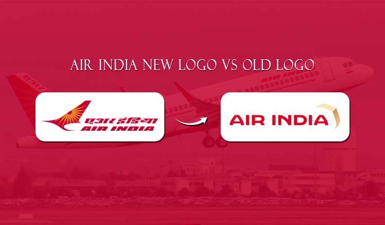
Air India’s old logo is written in red color in both English and Hindi. It shows a red swan with orange spokes, inspired by the Ashoka Chakra. Air India’s new logo is called ‘The Vista’ and consists of red, gold, and purple colors.
This new makeover of Air India reflects four things:
- Possibilities
- Progressiveness
- Confidence
- Authenticity
During the event, company seniors also spoke about how this new logo reflects the company’s history and commitment to its customers.
Why This Change?
Have you watched the Batman movie? Even Batman upgrades his gadgets. Every company needs updation so that they can understand their consumer’s changing needs.
After the acquisition of Air India, the Tata Group wants to revamp the image of the company so that people know the company’s perspective. According to a Tata Group spokesperson, the Air India symbol is a part of the Vihaan.AI program.
Here are the 3 main reasons behind this change:
- To Build Trust Among Customers
- To Upgrade Performance
- To Rebrand Company
To Wrap Up
For any company or industry, the logo represents its identity, emotional connection, professionalism, and credibility among consumers. The new Air India symbol shows that the company is now ready to comprehensive quality service to its consumers. You will see this new logo from December 2023. Let’s hope for a good change.
FAQs About Air India Logo
Ques 1. Is Air India changing its logo?
Ans. Yes, Air India changed its logo and the New Logo is ‘The Vista’.
Ques 2. Who designed the new Air India logo?
Ans. Tasneem Ali designed Air India’s New Logo. They wanted a logo that looked traditional and represented world-class service.
Ques 3. What is the New Logo of Air India?
Ans. The New Air India Logo is named ‘The Vista’. The logo inspiration is taken from the peak of gold window frame styles. This kind of style represents Air India’s confidence, progressiveness, and bold outlook.
We hope this article will be helpful to you. Stay tuned for upcoming articles.
READ MORE: Top 10 Electrifying Color Trends of 2023!
If you like our article, please subscribe to BsyBeeDesign for the latest updates on design. If we forget anything, share your creative ideas in the comments section.
Follow us on Facebook, Linkedin, Instagram, Pinterest and Youtube.


