


Think once about a condition when you have to display a desktop-friendly website on your mobile phone. Would it be possible to check out every single thing on the site on your mobile phone screen easily? And are you free to read out its content clearly?
In the before time it may not have, But now it is able to be done!
Before moving ahead, you need to know that this article has been written after the deepest research. Moreover, has not included any duplicate or copied content.
In this article, you will get to know about a framework through which you can simply arrange your website size to any device style. In other words, you can smoothly convert the interface of your website to different screen sizes whether it is a mobile, tablet, or laptop.
For having profound and practical knowledge, you have to read out the further down-mentioned content. So, without making ado, let’s check it out.
What are Bootstrap Media Queries?
Bootstrap is a framework that allows a website or web page to layout for different screen sizes of different devices using media queries. Whereas media queries are the features of CSS (Cascading Style Sheet) a computer language that gives a perfect structure to web pages using HTML or XML documents.
Generally, the bootstrap media queries framework is used by developers to arrange the width, height, content, image, and overall size of the site. This framework has been categorized into three types, version 3, version 4, and the latest one is version 5. Where all the categories have been updated thereafter the basic one, called bootstrap media queries 3.
As further info, every category has its available breakpoints. For example, bootstrap media queries 3 has, 4 breakpoints SM (small), MD (medium), LG (large), and XL (extra large). In the bootstrap media query 4, there are 5 breakpoints that are None (extra small), SM (small), MD (medium), LG (large), and XL (extra large).
Lastly, the latest version called “Bootstrap media queries” 5, has six breakpoints None (extra small), SM (small), MD (medium), LG (large), XL (extra large), and XXL (extra extra large). Using the bootstrap media queries, anyone can make its website mobile friendly, tablet friendly, and desktop friendly at a single time.
What are the uses of Bootstrap Media Queries?
Regarding the website interface, you can use Bootstrap media queries for multiple reasons. So, without making it delay, let’s get to know each of them one by one.
- The bootstrap media queries allow you to make your website mobile-friendly, tablet-friendly, and desktop friendly at a single time. Consequently, this framework support to different screen sizes and provide a better user experience.
- The bootstrap media queries do not support various devices screens only but also make the website readable & understandable on all electric systems. Actually, it makes the content, column, images, orientation, etc automatic and that’s why the site gets fits all device screens perfectly without any coding work again and again.
- In the present time, it is quite possible to display or run a website on a mobile phone but in the past time it wasn’t. Therefore, the bootstrap media queries are specially designed to give a mobile shape to your website and provide a better experience for you. Bootstrap media queries are largely used to make a website mobile-friendly. Additionally, give flexibility to the customers to run their desired website on their mobile device.
- Since some coding work, the bootstrap media queries make the website’s size easily capable that it can simply match with the pixels of the device screen size. And later can display on it.
- Bootstrap provides a set of media query breakpoints that you can use to create a responsive design
1. Extra small devices (less than 576 px)
   CSS Class: .col-
2. Small devices (576 px and up)
   CSS Class: .col-sm-
3. Medium devices (768 px and up)
   CSS Class: .col-md-
4. Large devices (992 px and up)
   CSS Class: .col-lg-
5. Extra large devices (1200 px and up)
   CSS Class: .col-xl-
6. Extra extra large devices (1400 mpx and up)
   CSS Class: .col-xxl-
To use these breakpoints, you can add the appropriate CSS class to your HTML element.
For Example:
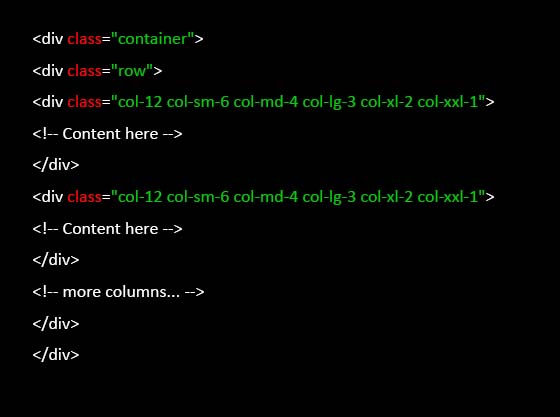
In the above-mentioned example, the .col-12 has been applied to all devices. However, for different screen sizes, the column will be adjusted automatically based on the defined classes.
For instance, on small devices, each column will take up half of the width (col-sm-6), and on medium devices, each column will take up one-third of the width (col-md-4), & so on.
As we’ve understood the scenario of the HTML element and layout of the custom style. In other words, you can also these breakpoints directly in your CSS code to create the custom style based on the device width.
For Example:
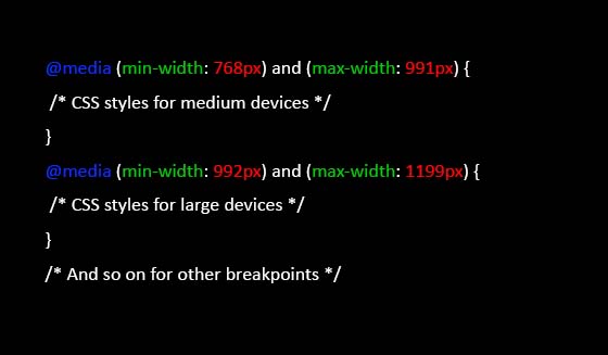
By using Bootstrap’s predefined breakpoints & classes and creating your custom media queries you can simply build up responsive designs that will be adaptable to different screen sizes.
How to implement the Bootstrap Media Queries?
As we’ve mentioned earlier, the bootstrap media queries can be possible just by performing the CSS (Cascading Style Sheet) a computer programming language. So, here you are required to do some coding section through which you can write the bootstrap media queries.
By applying some coding section, you can align your website for every screen size, whether it is a mobile phone, tablet, or laptop. But for this, you have to write some code for each and every change in the layout of your website. As every person does not carry developer skills, so here we’ll let you know about a basic tool through which you can check the different layouts of your website. So. let’s begin!
- Firstly, you have open a web page that may carry 4 products on your desktop screen. As you can see all 4 products are shown to you in a single line. Now, copy the URL link of the web page and open it up in a new tap, here we are going to convert it into a phone screen. Once, the URL has opened into a new tap, you just need to right-click there and click on the last option mentioned as the “Inspect option”.
- As you will click on the inspect option of the browser tool then the source code page will open automatically. Now, you have to click on the “double box” option mentioned on the left of the element option. Once you will click on the “toggle device toolbar” then your webpage will automatically convert to the mobile screen.
- To check out the conclusion, you can see that, the “Responsive option” will appear to you at the top of the page. Here, the responsive word represents the mobile screen & also you can check that the 4 products that were shown to you in a single line are now showing in two lines.
Here we will use the tool that is provided from the browser side, for easy and simple implementation. Remember that you can use it only to check out the devices’ basic screen layout. But if you want to change every bit of information or want to make your site all devices friendly then you’ve to use the coding section of it.
Final Thought!
If you are completely unaware of how a website or web page can convert itself to get fits into different device screens size. And if you want to make your own website user-friendly that can simply display all-size device screens then this article will assist you. This article will introduce you to the basic of bootstrap media queries that allow you to display your website on all device screens.
Apart from this, will introduce you to the basic implementation, through which you can see how a desktop website will look like by displaying a mobile screen. And also, let you know about its uses. Want you to spread out your knowledge for your website let’s jump into the article.
We hope this article will be helpful to you. Stay tuned for upcoming articles.
READ MORE: What is Cloud Stacking SEO? How to use it in SEO Techniques?
If you like our article, please subscribe to BsyBeeDesign for the latest updates on design. If we forget anything, share your creative ideas with us in the comments section.
Follow us on Facebook, Linkedin, Instagram, Pinterest and Youtube.


