Often we hear words and terminologies that we don’t care about till we learn their significance in the industry. Two such terminologies are CMYK and RGB. They play a significant role which is directly proportional to what you are creating in your design and trust us when we say, these are must-know settings. We have a handy guide for you right here to sort all doubts in just one crisp read. Let’s get back to the basics with Color Fundamentals.
Let’s get the acronym deciphered first.
Color Basics
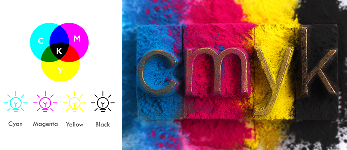
CMYK: Cyan-Magenta-Yellow-Black
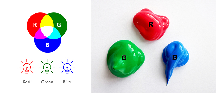
RGB: Red-Green-Blue
CMYK and RGB colors are used differently for various mediums and purposes.
Let’s look into CMYK
- The digital printing method requires a printer to print color on paper using CMYK colors, which is a four-color model, employing the colors cyan, magenta, yellow and black in variable quantities to generate all of the required colors when printing images.
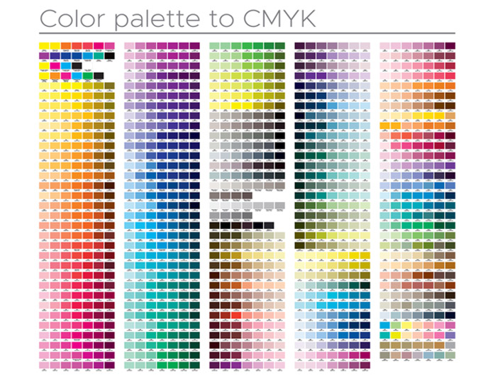
- In each step, additional unique color i.e the light is substracted or absorbed, to formulate colors. If the first three colors are combined, the outcome is not exactly black, but fairly a very dark brown.

- The K color, or black, is utilized to effectively remove the light of the printed image, which is how the sight recognizes the color as black.

Let’s look at RGB
- RGB is the coloration scheme associated with electronic displays, such as LCD monitors, scanners and digital cameras.
- The primary colors, get waves of color addition in this one of Red, Green and Blue, in several levels to produce a good plethora of diverse colors. If the three colors are merged and exposed to their complete range, the outcome is absolute white.

- If all three colors are combined to the least/ minimum degree or value, the output is black. Photo editing software and programs use the RGB color mode as it gives the most comprehensive range of colors.
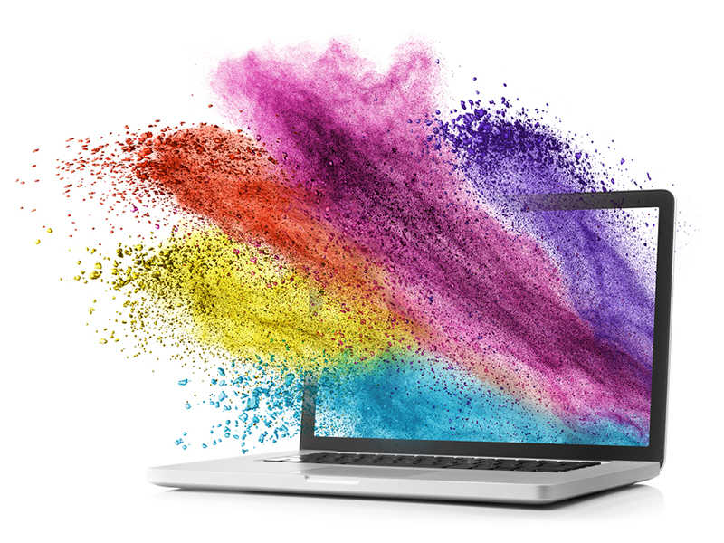
When you don’t know which to use the answer is simple. When printing, go for CMYK as the white is not present in it, making it suitable to print on white sheets, etc., while RGB with its wide spectrum of colors does better on-screen and is more suitable for digital representation. The world of design has a knowledge bank that knows no limits, but we assure you that in your quest to learn, start with the basics to build a solid foundation.
We hope this article will be helpful to you. Stay tuned for upcoming articles.
READ MORE: Everything Aesthetic About Windows 11
If you like our article, please subscribe to BsyBeeDesign for the latest updates on design. If we forget anything, share your creative ideas with us in the comments section.
Follow us on Facebook, Linkedin, Instagram, Pinterest and Youtube.


