Hey Designers! We’re back with another guide to open the doors of creativity and elevate your designs. In this blog post, we’ll delve into the typography design trends for 2023, providing you with valuable insights and inspiration to enhance your typographic compositions.
Typography is such a powerful tool that can transform a design, and by keeping up with the latest trends, you can ensure your work remains fresh, engaging, and visually impactful. So without any further ado, let’s dive in and explore the typography design trends that will shape the design landscape in 2023.
Typography Design Trends 2023
Type Distortions
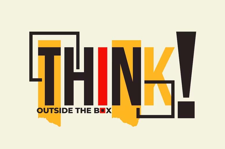
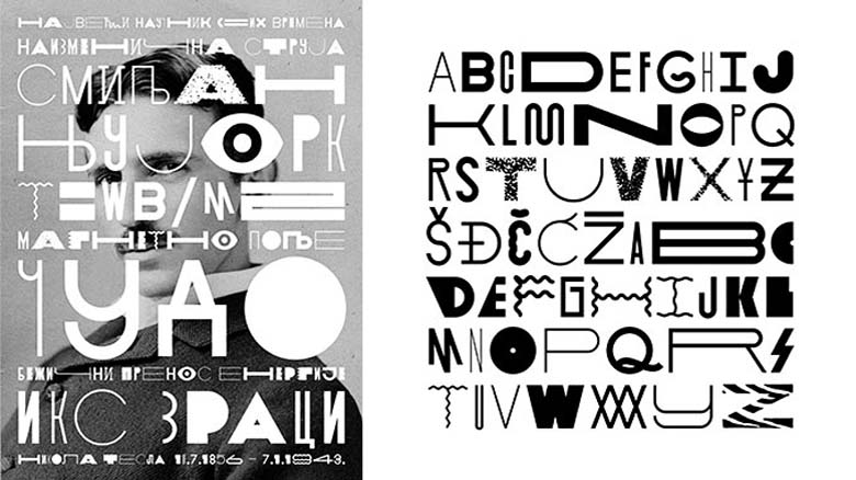
This year, typography designers are pushing the boundaries of typography by experimenting with various distortions and transformations. This includes stretching, warping, stretching skewing, fragmenting, or morphing the letterforms in unconventional ways. These experimental distortions can result in intriguing and unexpected visual compositions and are often used in album covers, posters, digital art, or avant-garde designs. They allow creatives to break free from traditional typographic conventions and explore new visual possibilities.

Imagistic Type
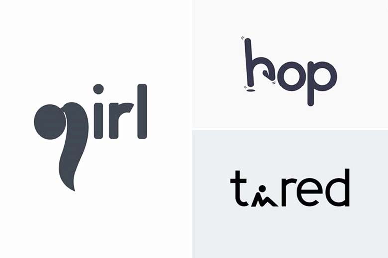
By integrating visual imagery, type designers can create expressive designs that go beyond the limitations of text alone, delivering visually stunning and engaging typographic experiences. The imagery can range from photographs, illustrations, textures, patterns, or abstract visuals and reinforces the concept behind the text, adding depth and context to the design.
Pixel-Inspired Type
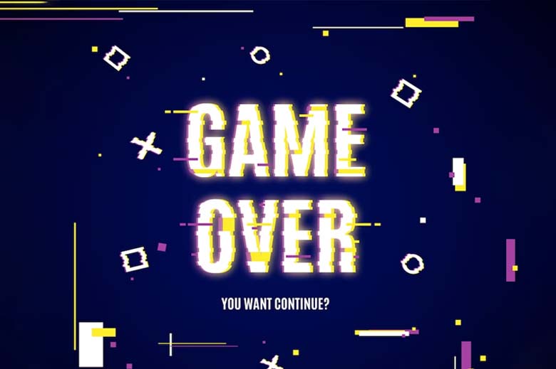
It’s a design trend that draws inspiration from the aesthetics and visual characteristics of pixel art. This style embraces the blocky, grid-like appearance of pixels to create typographic compositions with a distinct retro or digital vibe. You must’ve played the old version of computer games in your childhood. Remember how it was all pixelated? Doesn’t it tap you into nostalgia?
This is how it creates distinctive typographic compositions that stand out in a digital or retro-themed context.
Fluid Type
It incorporates fluid and organic forms within typography. By manipulating letterforms to create flowing, curvaceous, or abstract shapes that mimic the fluidity and movement of liquids. It emphasizes smooth transitions, dynamic curves, and a sense of motion within the typography. The boundaries between characters may become fused together, resulting in an interconnected and cohesive typographic composition.

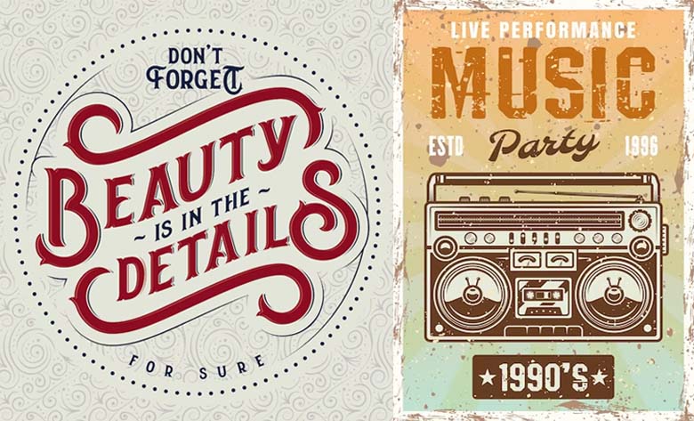
Vintage Elegance Serifs
These serifs are characterized by their delicate and refined letterforms, that embody a sense of classic beauty and sophistication reminiscent of bygone eras. They exude a sense of timelessness and evoke nostalgia, charm, and culture, often featuring high contrast between thick and thin strokes and elegant flourishes. A few examples include Bodoni, Didot, Baskerville, and Century Schoolbook.
Types of Typography in Graphic Design
Typography designers use various types to convey their message and create visually appealing compositions. The choice of typography depends on the design’s purpose, target audience, and the desired visual impact. Let us have a look at some of the most important types of Typography in Graphic Design:
Elegant Serifs
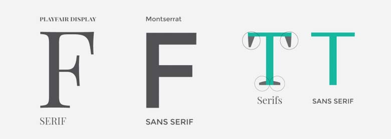
Serif typefaces have small strokes (aka serifs) at the ends of characters. They are often associated with traditional and formal designs, and they convey a sense of elegance, professionalism, and authority. A few examples include Times New Roman, Baskerville, and Georgia.
Modern Sans Serifs
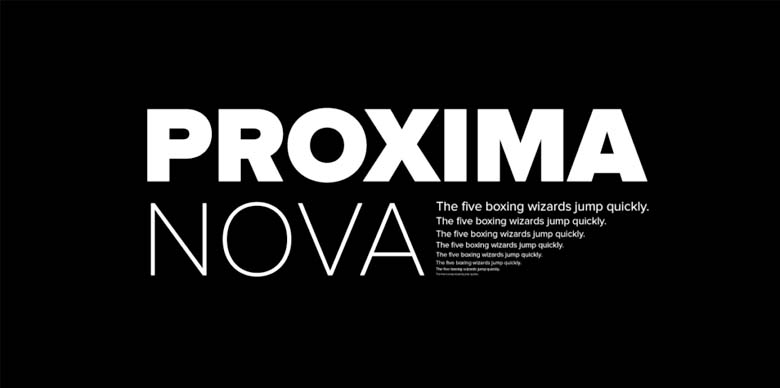
Sans means ‘without’ and these kind of typefaces do not have serifs, making them appear clean, modern, and minimalistic. They are commonly used for digital interfaces like UI UX, and convey a sense of simplicity and clarity. Some popular sans serif typefaces include Helvetica, Arial, Poppins, and Futura.
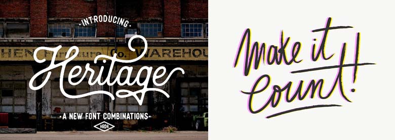
Script
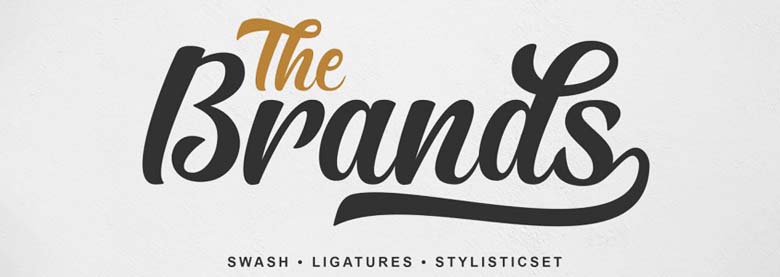
Script typefaces mimic cursive handwriting, featuring flowing and interconnected letters. They are often used to add a touch of elegance, sophistication, or playfulness to designs. Script typefaces are popular choices for wedding invitations, branding, and feminine-oriented designs. A few examples to name include Lobster, Pacifico, and Brush Script.
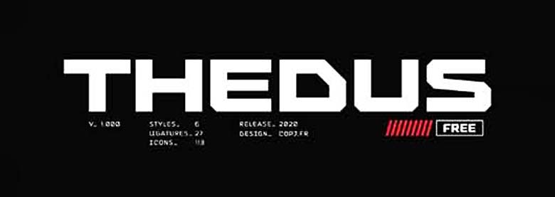
Display
Display typefaces are highly stylized and distinctive, often used for the section which you want to highlight like headlines, logos, or attention-grabbing elements in design. They come in various styles, such as condensed, expanded, or decorative, and are designed to make a bold statement. A few examples include Impact, Cooper Black, and Bebas Neue.
Handwritten
These typefaces emulate the look of natural handwriting, bringing a personal and organic feel to designs. They can add warmth, authenticity, and a human touch. Handwritten typefaces are often used in invitations, greeting cards, and designs aiming for a personalized and friendly vibe like Comic Sans MS, Marker Felt, and Segoe Script.
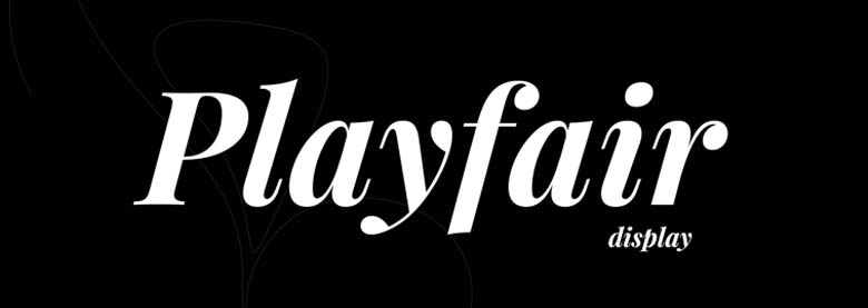
Display Serif
Display serif typefaces are characterized by exaggerated serifs and distinctive letterforms. They are often used for titles, headlines, or in designs that require a strong visual impact. They evoke a sense of elegance, luxury, or historical aesthetics. Try out Bodoni Poster, Didot Display, and Playfair Display.
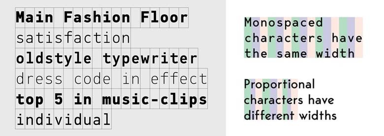
Monospaced
One specialty of Monospaced typefaces is that they have equal spacing between characters, providing a consistent width for each letter. They are commonly used in coding, typewriter-like designs, or when designers want a structured and organized appearance. A few examples include Courier, Consolas, and Inconsolata.
How to make your Typography Look 10x Better
Few Examples: Check this latest post of BsyBeeDesign!
View this post on Instagram
Importance of Typography Design we tend to overlook
Let us start this with a quick question. Shall we?
Would you read something that is not readable enough? Of course Not!
So, clearly whatever you read is technically a typography used for effective communication, information transfer, and user engagement. It allows readers to quickly and effortlessly absorb the content, understand the message, and navigate through the information provided. Now, think of a text/content which is not readable enough, it can present various challenges. It may cause frustration, confusion, or a loss of interest for readers. Difficult-to-read text can lead to a negative user experience, making it harder for people to extract the intended information or message.
Next up, Let’s figure out how what should you consider for better readability of your selected typography.
It involves factors such as font choice, font size, line spacing, tracking, Kerning and contrast between the text and the background. Typography designers aim to optimize these elements to ensure that the reader is legible and easy to read.
How to use Typography Design Appropriately (A Step-by-Step Guide):
Using typography effectively in design involves several key considerations. Here are some guidelines to help you make the most of typography in your designs:
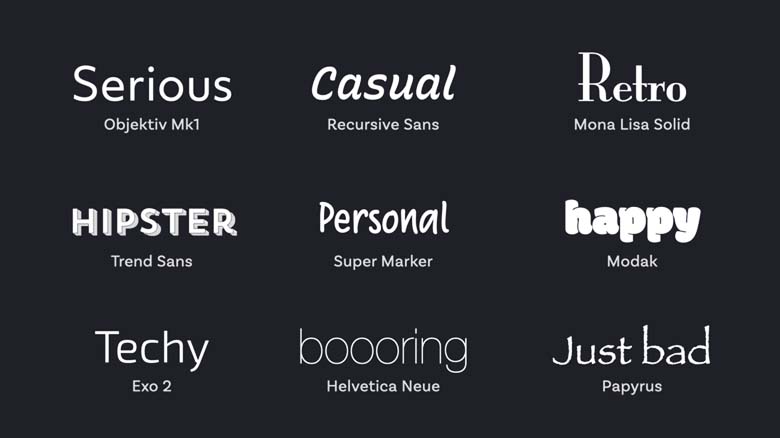
Step 1: Select the font that aligns best with your design or artwork: By selecting fonts that align with the overall design objectives and the message you want to convey does half of the job already. Consider the tone, mood, and purpose of your design. Use serif fonts for a more traditional or formal feel, sans-serif fonts for a modern and clean look, or display fonts for a distinctive and attention-grabbing style. Ensure that the chosen fonts are legible and suitable for the intended medium and audience.
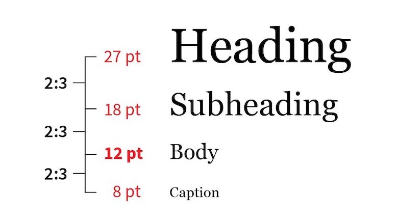
Step 2: Maintain a Hierarchy: Do you have 2 or more types of text? Then, it’s always best to create a visual hierarchy within your design by varying the font sizes, weights, and styles. This helps guide the viewer’s attention and emphasizes important elements. Use larger and bolder fonts for headings or primary messages, and smaller, lighter fonts for secondary or supporting text. Hierarchy also helps in a quick scan of the overall text & enhances readability.
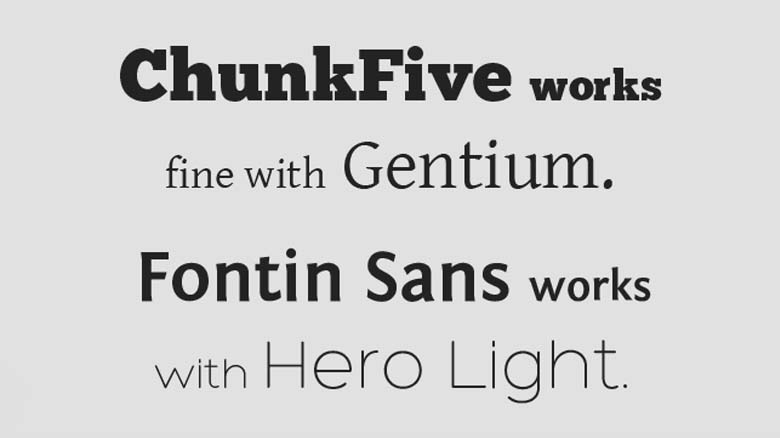
Step 3: Add a dash of Contrast: Contrast will legit change the whole typography design game by adding visual interest. Contrast can be achieved through differences in font size, weight, color, or style. However, ensure that the contrast doesn’t compromise readability.
To Give You a Demo:

1. Take up any type you like.
2. Write two words.
3. Make 2nd one bolder while keeping the 1st one regular.
3. Now, change the color of 2nd word with your favorite color.
Voila! See the difference yourself!
Balance the placement and distribution of text elements within the design to create a visually pleasing composition.
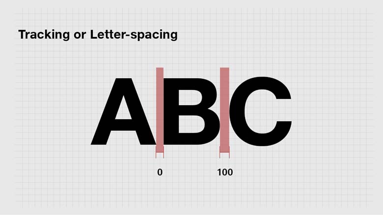
Step 4: Spacing and Alignment is really the key: A minor alignment issue can make your design look distorted. Pay (extra) attention to spacing and alignment to improve the legibility and overall aesthetics of your typography design. Adjust the letter spacing (tracking and kerning) and line spacing (leading) to ensure readability. Align text elements consistently and purposefully, based on the design’s requirements and visual appeal.
Step 5: Experiment and Iterate until it doesn’t feel right: Don’t be afraid to experiment with typography in your design process. Optimal legibility is achieved by avoiding excessively long lines of text, ensuring appropriate line breaks, and using a font size that is suitable for the medium and viewing distance. Test the readability of your design by previewing it at various sizes and distances.
Final Thoughts?
Trends come and go! What remains is ……..?
Of course the base (Your typography). Always ensure whatever type you proceed with, is serving the purpose to your target audience and aligns with the client’s requirements.
Now, Let’s create something cool. Happy Designing!
We hope this article will be helpful to you. Stay tuned for upcoming articles.
READ MORE: Typography trends you should know in 2021!
If you like our article, please subscribe to BsyBeeDesign for the latest updates on design. If we forget anything, share your creative ideas with us in the comments section.
Follow us on Facebook, Linkedin, Instagram, Pinterest and Youtube.

