Top 8 Typography Trends
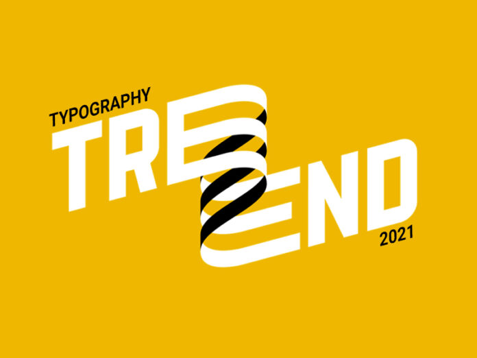
Typography is one of the most basic and intelligent aspects of design. Ever wondered why fonts are so important? Why do certain words written in a particular way have more impact than others? A slight variation in the font can change the whole outlook of an entire design or page. If you know what we are talking about, you must have experienced it somewhere! It can change the dynamics completely. Typography is a sense, a feeling that evolves with time. Coming up with this year’s trends, here are a few typography trends that you can incorporate in your design to get the boost you were looking for.
The Classic Serif
You can’t deny the elegance of serif has. The little lines have been visually appealing more than ever. It is the complete sort of font to use with rarely a need for collaborations though adding a sans serif in combination cannot hurt if used right. Never mix this with any other style or font when you aim to keep it minimal.

Psychedelic Fonts
A popular one, recognized amongst the millennials with their new desires and forever young attitude. These can go well where graphic plays more role than core legibility criteria.

Outline Fonts
Fonts like these are creative, have a negative-positive impact which is a timeless trend that has been used and has been famous for the strong aura of design that comes with it.

Bold Curves
Gone are the days where thin curves made it to the visuals because now it is all about being daring. The beautiful curvy with thick lines can boom your graphics to the next level.

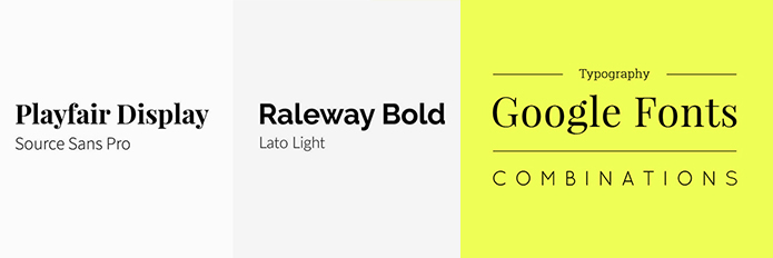
Combination Format
Use it well and be rewarded. If you apply it unwisely, you will be disappointed. Combinations are the most popular style of typography out there. From magazines to every flyer or creative have used combination typography. The formula is to use something extremely minimalist, like a sans serif with any other font. Simple as that.
Retro Revived
The Retro fonts can give this rich feel to any design because it carries this lovely person and so much body that it can cause an effect just by being there. There is no retro without drama, this is year is all about drama.

Ultra-Minimal
You can’t overuse an ultra-minimal, one of the safest bets and go-to font type. Never use it for a statement but more as a supporting font for those details that do not need the center stage yet essential enough to be there.

Sweet Sans Serif
If this is not a part of a combination font, you will regret it. These fonts work wonders as a slender, clean font but strong and complimenting to every other font. If you know you are halfway through.

The emphasis on typography is the most logical and quintessential in understanding design or any visual communication. If you play your fonts right, you can own your design.
Hope this will be helpful to you.
If you like our article, please subscribe to BsyBeeDesign for the latest updates on design. If we forget anything, share your creative ideas with us in the comments section.
Follow us on Facebook, Linkedin, Instagram, Pinterest and Youtube.











knowledgeable content