Visual Elements and Design Principles together help in conveying the message of the design. They are like strict rules that if used by a designer give amazing results. Let us go through a few Visual Elements and Design Principles.
Let’s talk about Visual Elements!
Line
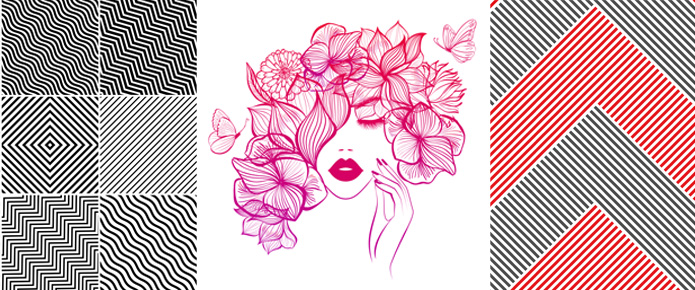
The line is the most important element of design. A line can be Vertical, Horizontal, Zig-Zag and Curved. It can be of different sizes and Densities. A point creates lines and shapes. Lines can be used in digital design as outlines to break different areas.
Color
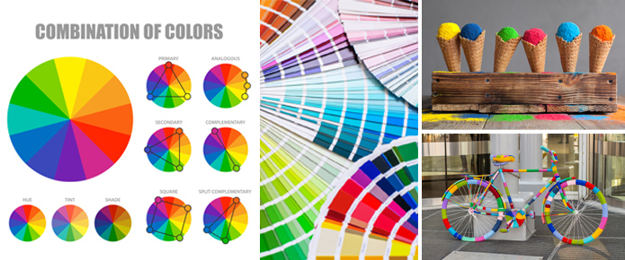
Color is essential for both user and the designer. It can be used in Backgrounds, Shapes, Typography and other elements. Every color has a different meaning, and it gives a different impression when applied to shapes or elements. Colors trigger the emotions of the user.
Colors have different characteristics like Hue, Shade, Tint, Tone, Intensity, etc.
Shape
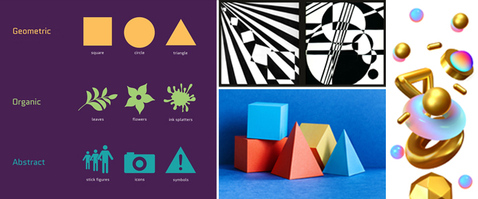
It’s the element that gives meaning to the design. Every shape reminds us of something. For example, a crescent shape reminds us of the moon similarly, an ellipse reminds us of an egg. Shapes can be described in three ways Mechanical, Organic, Abstract.
Space
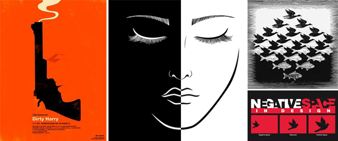
In a design, there is negative space which affects the elements drawn around it. Space gives a distinction between two elements of Design. It is used to both separate and connect elements in a design. By using the space correctly in a design, we can create rhythm. It allows designers to make two-dimensional space and 3D illusions.
Form
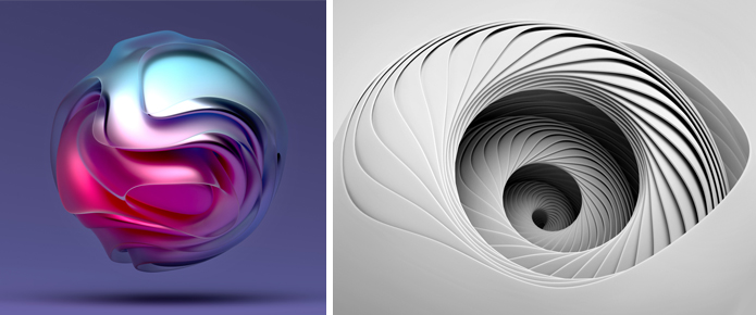
Anything that is three-dimensional can be described as form. It adds volume and contrast to the design. There are two types of forms Geometric and Natural form. The form can be created by combining two or more shapes.
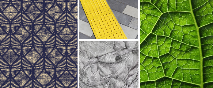
Texture
There are two types of textures Visual and Tactile texture. Visual texture exists on a flat surface and it has lines, shapes and colors. Tactile textures can be felt it can be soft, rough, fluffy, etc. Visual textures play a very important role in Graphics Design.
Let’s talk about Design Principles!
Contrast
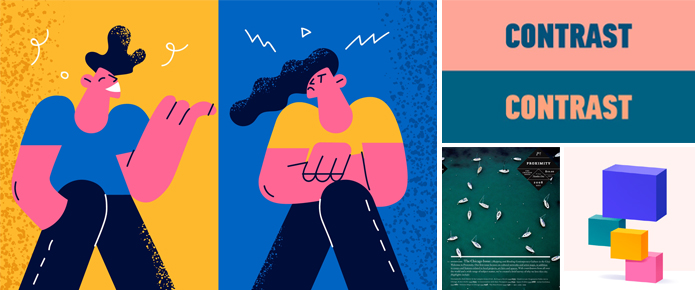
When two elements on the page are different in any way there is a contrast. It is not only associated with differences in colors but also with font sizes, textures, etc. The elements should be completely different, for example- When a smooth texture is combined with a rough texture or when a big, bold and grungy font is combined with a Sans-Serif font it’s contrast.
Whenever we want our audience to get highly engaged with the design, contrast is used, as it makes any design attractive and expressive while highlighting major points. Below are a few examples to explain the contrast in detail:
Focal Point
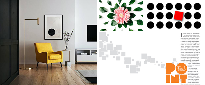
The Focal Point is the most important thing that a designer should establish in any design. The best way to define a focal point is to find key points of your design and make it stand out, in such a way that your eyes are straight away drawn to that key element when you see the design.
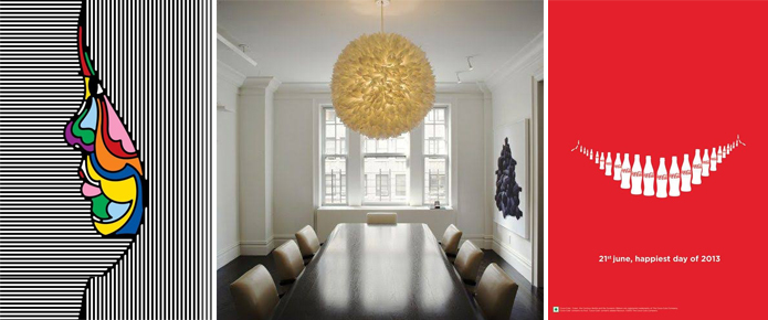
Getting Noticed! Is a focal point. Whenever a client asks you to make the logo bigger than the other elements in your design, they are basically asking to change the focal point of the design. The Focal Point can be created by a designer intentionally almost everywhere from Graphics to interior design. Here are a few examples to depict the same.
Balance
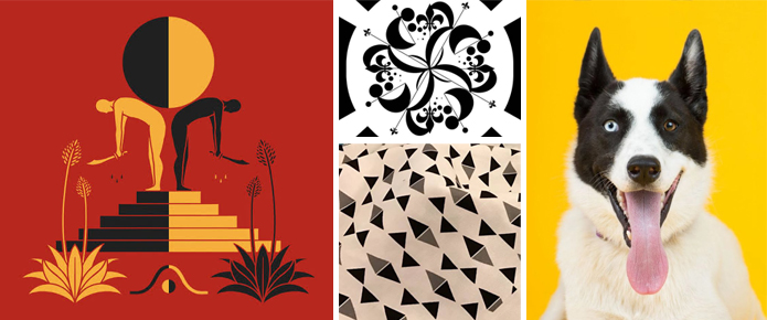
The distribution of elements is known as Balance, It means arranging both positive elements and negative space of the design in such a way that it looks aesthetically appealing and fitting. There are many types of Balance in Art and Design:
- Symmetrical
- Asymmetrical
- Radial
- Mosaic
- Discordant (Crystallographic Balance)
Balance is basically based on the visual weight of the elements. Visual weight is the attention span the viewer pays to the design/art. If a particular design, the webpage is balanced it makes the user comfortable to browse it for more time. If there is a lack of Balance in any Art, Graphic, or other forms of design the user/audience automatically thinks that something is off in the design and loses interest. Therefore, balance plays a key role in giving stability to the design.
Emphasis
Any part/element of design, art, or photography that first attracts the interest of a viewer. The emphasis in graphic design can be created in many ways like by using color or by using value or by using perspective and complementary colors. Emphasis can be drawn to anything, for example, a CTA button, a particular color or elements, etc. Emphasis is used in most fields of Design.
Design elements that can be used to create Emphasis in graphics design are:
- Lines: If your design has vertical lines, and you break the pattern in between it creates Emphasis.
- Shapes: In between circles if the designer suddenly uses other shapes, it creates Emphasis.
- Colors and Textures: Shift in colors and textures can create Emphasis. There are many other ways it totally depends on the artist or the designer which one to choose for a particular design.
Unity
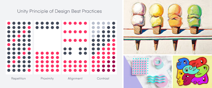
If your design is able to communicate a single idea then it has Unity. Also, when all the elements of design work together then the design is in Unity. It unifies all other Principals of Design. Without Unity, even a complete design can look incomplete. It gives a sense of cohesion to the design.
Whether it is a Logo, flyer, Brochure, Magazine cover, or anything else it needs to have strong Unity in order to complete the design otherwise it looks disjointed.
If there is a relationship between all the elements of Design, that means there is Unity, whether it is in a Web Page or a small Logo. Unity can be created through Proximity, by using Shapes, Repetition, or other elements.
Variety
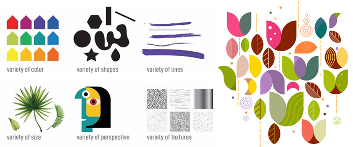
Something that adds interest to an artwork is Variety. Mixing up geometric shapes with an organic shape or varying elements in a design are the typical ways of creating Variety. It gives uniqueness to every design. It gives the Power of Expression to a Design or Art. Variety can be used in different forms of design from Graphics to Textile design. It can be used anywhere and everywhere; it keeps the audience /viewers interested in the Design without getting bored. Variety is the spice of the Design.
By using different Visual Elements and Design Principles you can create attractive, sensible and aesthetically appealing compositions. Visual Elements and Design Principles are timeless so by using them we can make thought-out designs that will engage our audience.
We hope this article will be helpful to you. Stay tuned for upcoming articles.
READ MORE: What is Graphic Design?
If you like our article, please subscribe to BsyBeeDesign for the latest updates on design. If we forget anything, share your creative ideas with us in the comments section.
Follow us on Facebook, Linkedin, Instagram, Pinterest and Youtube.

